5 Tips for Best Food Website Design in Your CPG Business Niche

If you are a CPG business in the food industry, you must know that having a “delicious” website is paramount. From images to videos, your product is the main draw, and knowing how to present it in the best light is key when designing or redesigning your food website.
The best food website design takes into consideration the layout, messaging, content, and user experience in order to make your website into a memorable experience for your visitors as well as a marketing tool that can convert leads into customers.
What Should a Food Website Have?
A food website is similar to other websites, with a few minor differences. Since food is very visual and we process visuals better than text, it is extremely important for food and beverage businesses to focus on visuals and keep their sales copy short, targeted, and to the point.
Here are just a few other tips on what a food website should have to stand out from the competition and succeed as an effective marketing tool:
- A food website should state the company’s “why” – or its reason for existence (the personal story that started it all) – how it does what it does, and why it is the best at what it does.
- It should have clear messaging that doesn’t confuse visitors, that piques their interest, that keeps them on the website, and that has them take particular action.
- It should be free from clutter and have lots of white space, which makes the website user friendly and easy to navigate.
- It should include quality and enticing photos of the food both close up and in a real life context.
- It should add value to the visitors or be very helpful.
- It should make it easy for your potential customers to get in touch with you or buy your products through multiple calls to action.
Food Website Ideas That Will Help You Stand Out
When it comes to best website design techniques for food, the type of visuals and content used truly matters. The visuals will entice visitors with your product quality and appeal (the hook), while the content will help explain why your food product is worth purchasing, which will lower your leads’ hesitation towards making a purchase.
When it comes to creating a winning food website, always have your customers in mind! Look at your product from your main customer avatar’s perspective and come up with main questions or points of resistance that your visitors may have when interacting with your brand. What interventions would make them more likely to purchase your product? Write those points down and then look at your website from the perspective of a new visitor that has all the resistance and skepticism when it comes to interacting with a new brand.
Another food website idea is to study your competitors and see what aspects of their website you find the most interesting and engaging. Is there a particular feature that is helpful and valuable? By studying other websites in the food business, your creative juices will flow and you’ll be more likely to come up with new ideas for your website that will help it stand out in creativity and visitor retention rates.
Finally, showing and teaching individuals how they can use your food product in various interesting ways will pique their interest in using your product further. Showcasing how your product can add to holiday festivities, special occasions, or help individuals have a better quality of life, will not only take your prospects on an exciting journey with your brand, but they will be able to imagine themselves tasting and experiencing your product themselves.
By seeing themselves in your images and content, you can much more effectively turn your visitors into leads and customers!
The best way to do so is through the use of recipes, blogs, and “how to” videos. Not only do these platforms provide you with an opportunity to showcase your products in a practical way, but they can easily give visitors many ideas on how to use your products in a creative and multi-functional way. From a marketing perspective, this is key for CPG brands looking to showcase the applicable use of their products and their return on investment when it comes to better quality of life and experience.
5 Tips for Best Food Website Design

Proper Design and Layout
When it comes to clean, modern design, creating proper layout with user experience in mind is essential. An intuitive layout helps visitors find exactly what they are looking for and keeps them on the website longer through engaging visual-content storytelling. It also allows them to navigate your content more readily through helpful links and calls to action.
Another component of proper design and layout is that websites, especially those whose business relates to food or products, should be mobile friendly. Over half of website visitors come from mobile devices, meaning that designing for mobile is important when it comes to customer acquisition.
Lastly, think of how you’d like your ideal audience to interact with your website. Will they use their mobile device to search through recipes in the kitchen while preparing ingredients? Will they be buying products through the website, and if so, is the process simple and accommodating? Will they be comparing your product with your competitors’, and in which way could you stand out?
When you put yourself in the shoes of your customers, you’ll have a better understanding of their experience – what they’re looking for and how you can best meet those needs.
The Importance of Images and Videos
For a food website, images and videos are paramount for showcasing your product in its glory. It is a chance to make your food product enticing by highlighting its features, usage, and recipes. In fact, did you know that most individuals (up to 80%) would describe themselves as visual learners? Our brains are designed to process images faster than text – 60,000 times more so, to be exact – making images a more persuasive and effective way to tell a story.
Food is inevitably one of our needs and pleasures, and images of food tend to alert our brains to a primal need that is hard to resist. Indeed, image psychology is powerful, and when you know how to utilize it in the right way to showcase your products in the best light, your website will benefit from better conversion rates and sales.
One important thing to keep in mind, however, is the importance of the quality of images you use. If your images don’t look appealing and are of a low pixel count, not only will your website look unprofessional, but it will likewise not create the psychological commercial impact that images can have when used properly in sales copy. Think of your website as a brochure of the best of what you offer and your images as evidence of the quality and deliciousness of your products.
Overall, quality images and videos can make or break food website design and can constitute the main reasoning behind users’ decision-making.

Targeted Brand Messaging
Knowing your ideal customers’ wants and problems will help you create messaging that will be targeted to answer these needs. Brand messaging should always have the following characteristics in order to be effective:
- It should mention your business “why” and “how” (why you do what you do and how you do it better than anyone in the industry)
- It should be clear
- It should include persuasive calls to action
- It should speak directly to your customer, be to the point, and reflect your personality
- It should showcase the features of your products and why your products are unique/better/healthier/more tasty
When you utilize these elements on all your marketing channels, you will clearly present your business to customers who are qualified and want to hear about what you have to offer. Targeted brand messaging is a lot like storytelling, where you are the guide on your customer’s hero’s journey. If your customer wants to feel satiated but healthy and bond with others through food, you can leverage this need in your massaging. Speak to those needs but don’t get lost in jargon and excessive rambling. Remember, a picture is worth a thousand words!
According to research, people don’t buy products but better versions of themselves. Taking the cues from some of the most successful food and beverage brands in history, by having your customers imagine how much better off they would be with your product in their lives, you will ensure their customer loyalty over time.
Effective Content Strategy

Images and videos are just a tip of the iceberg when it comes to lead generation, while your content strategy is “the whole enchilada.” Aside from recipes, blogs also hold a lot of power and sway when it comes to teaching your customers about your products and their benefits.
When it comes to a food website, SEO optimized blogs will not only attract qualified leads to your website organically, but they will likewise provide them with valuable information that will teach your visitors about information related to your product or industry.
Due to such generosity, visitors will instantly feel more connected to your brand and will be more likely to stay in touch through social media or by signing up for your lead magnet or newsletter. Individuals are more likely to purchase products from brands that they deem as unique, authentic, transparent, and generous. Be that type of a brand in all your content collateral, and your customers will award you.
An effective content strategy is based on understanding where your customers spend most of their time online and how best to reach them. But, don’t be pressured to be on all the platforms that are trending and that perhaps your competitors utilize! It’s more important to niche down on a few social media channels where you can create frequent and quality content than be on many where you post only once in a while.
The other elements essential to creating a winning content strategy is research and experimentation! You can do this by reviewing all your content and figuring out which received the most engagement and why. You can likewise study your competitors’ content and get ideas for your content strategy from their best performing topics.
Clear Calls to Action
If potential customers are confused about ways to engage with you or you make it difficult, they will choose to do their business somewhere else. Clear calls to action on your landing pages and blogs are essential when it comes to lead to customer conversions.
In design and copywriting, including calls to action in certain key places on your homepage, for example, can make it easy for visitors to contact you or buy your products. The upper right hand corner is known as the designated “call to action space,” since visually, our eyes and attention is first led to the logo and then slides horizontally to the upper right corner. This specific call to action should be visually catching in the form of a button or bold, large fonts.
Then, your website copy serves as a targeted story about why and how your products are better and how they would make your customers’ lives better.
At every juncture of this storytelling where a point is made that aligns with customer pain points or needs, another call to action should be offered. Some customers may need more time or persuasion, while others less, so breaking their daze of reading your copy with an action plan will be very effective in getting new purchases, sign-ups, or inquiries.
Your blog should likewise always have a call to action, especially in its conclusion. Since you are offering free advice and valuable content, your calls to action will prompt interested customers to stay on your website longer, learn more about you, and take action with a sign-up or a purchase.
The best calls to actions are always relevant, helpful, and generous (you can entice readers to “learn more,” get a sample of your product for free, or sign up for a coupon discount on their next purchase).
How to Strategize Your Food Website Content
There are a few questions to ask when it comes to understanding how your content aligns to your ideal audience. Here are a few important questions that can help you clarify your message and understand how your content relates to your users’ experience:
- Is my content about my audience? If not, how can I speak directly to my ideal customer avatar and lower their defense mechanisms to doing business with me?
- Is my content helpful and does it add value to my readers’ lives, or does it mostly highlight my company updates and product features?
- Do I show off my personality and am I transparent in all of my messaging?
- Am I clear in how I present my products and where visitors can purchase them?

The most important factor in creating an effective website copy is to know your audience and speak to its needs and pain points. If time and money pose their ability to make certain meals, your content can show them how your food items can help them save both time and money. If the amount of ingredients is the culprit, you can create simple recipes that show your audience how easy it is to make their favorite dishes using your product and a few other ingredients.
Another factor that you should consider is the popularity of certain foods and food-related terms as they relate to your business. One way to do so is to keyword research your product name and function (as well as the most popular types of dishes and recipes you can make with it) with an SEO keyword tool in order to get an idea about which phrases your potential leads are most likely searching for.
Additionally, you can use Google Trends to verify the seasonal and regional popularity of your product or any other terms associated with it. Once you have a clear understanding of user search analytics, you can then create targeted product or blog content that highlights these terms by providing valuable information to your website visitors.
An optimized recipe page or a blog are additional musts when it comes to building a relationship with your audience. Both can showcase your product in usage through effective storytelling and the ability to transport the reader to the kitchen table, feeling more nourished and content.
Here are just a few of our favorite tools that will help guide you to further strategize and execute a winning content marketing plan:
- 6 Essential Tips for Website Design and Layout
- CPG Website Overhaul
- Industry Secrets on How to Create Unique Content That Ranks on Top and Stands Out From the Competition!
Recipe Website Design Tips

Undoubtedly, people love recipes, and the more niched down they tend to be (for example, vegan, gluten-free, 5-ingredient, or sugar-free), the more targeted the content and the type of visitors that prefer it! When it comes down to it, you want to be as niche-y as possible with your content, since you want it to weed out those website visitors that will most likely not become customers. One main way to do so is to focus on your product’s main premise and create your recipes around that particular benefit.
For example, if your product replaces conventional milk with a nut milk like oat milk, your recipes could all fall under the category of “dairy-free” or “lactose-free.” That way, when individuals search for recipes with that designation on search engines, they can easily find your website/page and be enticed by your products.
In fact, the more targeted you are about what sets your product apart, the better! In marketing, if you try to satisfy or talk to everyone, you will fail to speak to anyone effectively. This again highlights the importance of knowing your customers and providing them with a customized experience for their lifestyle needs.
When you narrow down your pool of potential customers and only appeal to their sensibilities, you will not only have higher conversion rates, but will be embraced by a certain demographic that needs what you have to offer.
When it comes to recipes, images, ease of use, and user experience are the top ingredients to draw visitors to your page. You can think of your recipe pages as lead magnets that help warm up your audience to take the next step with you.
If you provide your audience with value, and offer them exactly what they’re looking for in terms of ingredients for their next meal, they will be persuaded to try your products. And if they like the end result, think about the potential length of the cycle of this customer’s journey and the possibility of him or her telling family and friends about your products.
Another feature of user-friendly recipe pages is to include interactive features to recipes, such as the ability to print them out or personalize them in some way. This is increasingly popular as individuals desire memorable and engaging user experiences that stand out from the norm.
For example, one way you can optimize your recipe pages for greater interactive capacity is to create a quiz to help users discover their new favorite dishes in each of your food categories.
Overall, the point is to be creative and to make your recipe pages come alive with a personalized touch and creativity. Here’s our take on how to create the best recipe page for your CPG brand, where you can get more in-depth advice on ways to make your recipe pages user friendly and worthy of sharing!
3 Best Food Website Designs (Case Studies)
Idea Marketing Group has worked with a number of food and beverage businesses to help them perfect their messaging, align their content with their sales goals, and improve their web design. Here are just a few of our best food website designs that showcase our clients’ business needs and how we approached the process of working on food website design to help meet them.
Eagle Brand
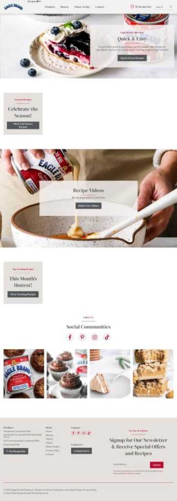
Eagle Brand wanted to create a new website that was more user-friendly and had better targeted messaging. They wanted their website to showcase what potential customers could do with their products, while looking more modern and being more easily navigable. Likewise, with so many features, the Eagle Brand team found it difficult to manage the website on the back-end and desired an easier way to make updates on their website.
Idea created a custom CPG website with messaging that simplified user flow, which allowed customers to easily find products they were searching for. This process included a complete overhaul of the website’s recipe section, which made creating, organizing, and saving recipe pages easily manageable.
The new recipe pages had the capacity to be filtered and featured options to save, share, or add recipes to a wishlist. To accomplish this, our web development team had to build a custom importer that would manage the import of hundreds of unique recipes. The new website also allowed the Eagle Brand team to easily make changes to the website text and images in order to keep up to date with seasonal highlights.

Bridgford Foods Corporation
Bridgford came to us to have custom web design created for their ‘meat snacks’ division that showcased their products and also delivered a powerful message. A family owned-business, Bridgford needed a design that reflected its commitment to family values and proud American heritage. The website likewise needed to provide customers with search and purchase features, such as the ability to purchase products online, locate product availability at local stores, and engage with Bridgford Outdoors content.
Idea web developers created a mobile-friendly, optimized site with unique features, such as a custom map that easily displays where customers can find Bridgford products near them. We administered a modern website redesign with uniform, targeted messaging that would better align with its ideal customer demographic. With this new design and strategy in place, the company was able to expand on its branding and continue to attract its target customers organically.
Phil Stefani Signature Restaurants
Idea Marketing Group has worked with Phil Stefani Signature Restaurants for many years on many aspects of their web design and marketing, from improving menu layouts and creating targeted social media campaigns to content management and digital strategy. We helped the brand build a corporate website presence by organically growing the presence of the individual restaurant website through a value-rich blog that publishes to multiple sources.
Our web developers, designers, and content strategists were able to create a comprehensive restaurant brand that reflects the company’s future trajectory and speaks to its ideal audience. The websites we developed for the restaurant group all have strong SEO features and rank well in top search engines like Google, Yahoo, and Bing.
Final Thoughts
When it comes to best food website design, understanding your ideal customer is key to creating effective design and content strategy. The most successful food websites always concentrate on the visuals and focus on selling their product experience and not its features (the best example of this is Pepsi, which used television commercials to sell a life that they associated with their product).
The most effective food and beverage design guides heroes on a journey toward transformation, understanding that their potential customers are always seeking a better version of themselves when they interact with products and services. However, it also prioritizes technical and search engine optimization.
Ultimately, we don’t buy the best products but those that have the best messaging! By using visuals and persuasive copy that shows how your product would improve the lives of your visitors, you will be way ahead of many other food websites in your niche.

