6 Essential Tips for Website Design and Layout (from our professional in-house web designers!)
When creating a new website, having a plan and creating a site map are key to engagement and conversion success. Think of your website as a roadmap that leads the user closer and closer to the treasure chest or your end goal – which is converting leads to customers! If you don’t know your ideal customer avatar well and the objective for each page of your website, it’s time to brainstorm your ideal business site ideas and learn a bit more from our following winning tips for custom web design and layout – endorsed by our very own team of professional website developers.
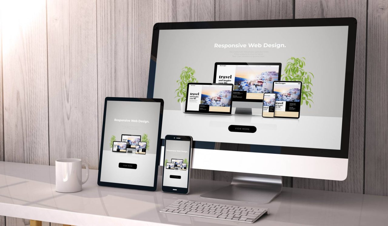
“Your website is the center of your digital eco-system, like a brick and mortar location, the experience matters once a customer enters, just as much as the perception they have of you before they walk through the door.” – Leland Dieno
What To Know Before Designing a Website
Website design, like website copy, is equally art and science. It involves understanding your sales funnel and creating a website that takes users on a journey from familiarity with your brand, to trust through greater connection, and finally, to becoming a customer and an ambassador. To do this, there are a few things you need to consider before designing a business website. To get started, ask yourself the following:
- What is the purpose of my website? Is it to inform (guide), entertain, or sell? What do I want my customers to do when they visit?
- Who am I speaking to directly? Who is my customer avatar and what needs and problems do s/he have that I can help them meet or overcome?
- How can I prove that I am the right guide to help my users on their journey? Which authority markers can I share that show my potential customers that I am trustworthy and the best person to help them? How do I share my knowledge so that it resonates with individuals looking for what I have to offer (that distinguishes me from my competitors?)
- How can I make the website about my customers and not about me? How can I make them the heroes on their journey?
- How do I want to appear to my customers (with my branding)? As fun/laid back/friendly, professional, authoritative/expert, or impersonal/personal?
- How much do I want to involve my own story in my branding? Do I solely represent my business (my backstory represents the core of what I do) or are my products/services front and center?
- What can I offer that stands out and is different from my competitors?
By writing out answers to these foundational questions, you can discover a lot about the pillars of your website structure and content. You will know exactly whom you’ll talk to, how to present your strengths, and how to entice leads into becoming customers.
These notes can be easily converted into a website plan that reverse engineers the answers you wrote to deliver a user experience with an end goal. Overall, by combining design and content, you can start creating a professional website worthy of design experts. But, before you attempt to do it all on your own, here are some essential tips for website design and layout given by our team of design experts at the Idea Marketing Group (recently recognized as a top web design company in Illinois in 2022 – go team!).
What Makes Good Website Design?
We think that websites with the best design share two core underlying elements: they understand who they are and where they’re heading and they know their core audience, or their ideal customer avatar. These two essential knowings underlie a company’s branding and marketing efforts and are the pillars of its success.
A website should be an expression of “why” a business exists and “how” it wants to help meet needs and solve pain points. What are your “why” and “how”? Most users need to connect with the “why” before they can be curious about the “how”.
If your “why” is not apparent, you risk seeming impersonal, detached, and generic, no matter how amazing and top-notch your products or services are. You can think of the why as a key in the doorway and how as an adventurous path that leads you inside. Entice your users with your why, and they will come with you on your journey of how!
Our own web designer, Sean Moran, states that a major thing when making decisions when it comes to website design is looking at the website and user flows from the perspective of the user, rather than your own personal perspective (which may be biased). Along with that, he emphasizes the importance of “truly understanding who your target user is and what their needs and wants are from your website.”
On a similar note, our web designer, Erin Karper, highlights that easy-to-read website content, minimalistic text on the homepage that entices the reader to click through to other internal pages, visual hierarchy that takes into account how visitors experience and navigate website content, and a website that is easy to understand and navigate are all essential elements of good web design.
What Are The Best Design Characteristics of a Website?
Some of the best design characteristics in website design center around providing an enjoyable and memorable experience to end users. Mainly, website design, layout, content copy, and technical logistics should work symbiotically to provide a wonderful impression of your brand and presentation of your services and products.
Design works together with these related core elements to truly be functional and experiential. The main characteristics of great design are:
- inclusion of white space
- brand-specific aesthetics
- easy and intuitive navigation
- functional layout
To see these core elements in action, think of your favorite website. Why do you like it so much? Write down what stands out on it, and you’ll notice that the design characteristics above will probably show up on the list! By studying the design features of your favorite websites, you’ll slowly realize the importance of an actionable website plan and well-thought out website layout, design, and user experience features.
6 Professional Website Design Tips for a Winning Website Design and Layout
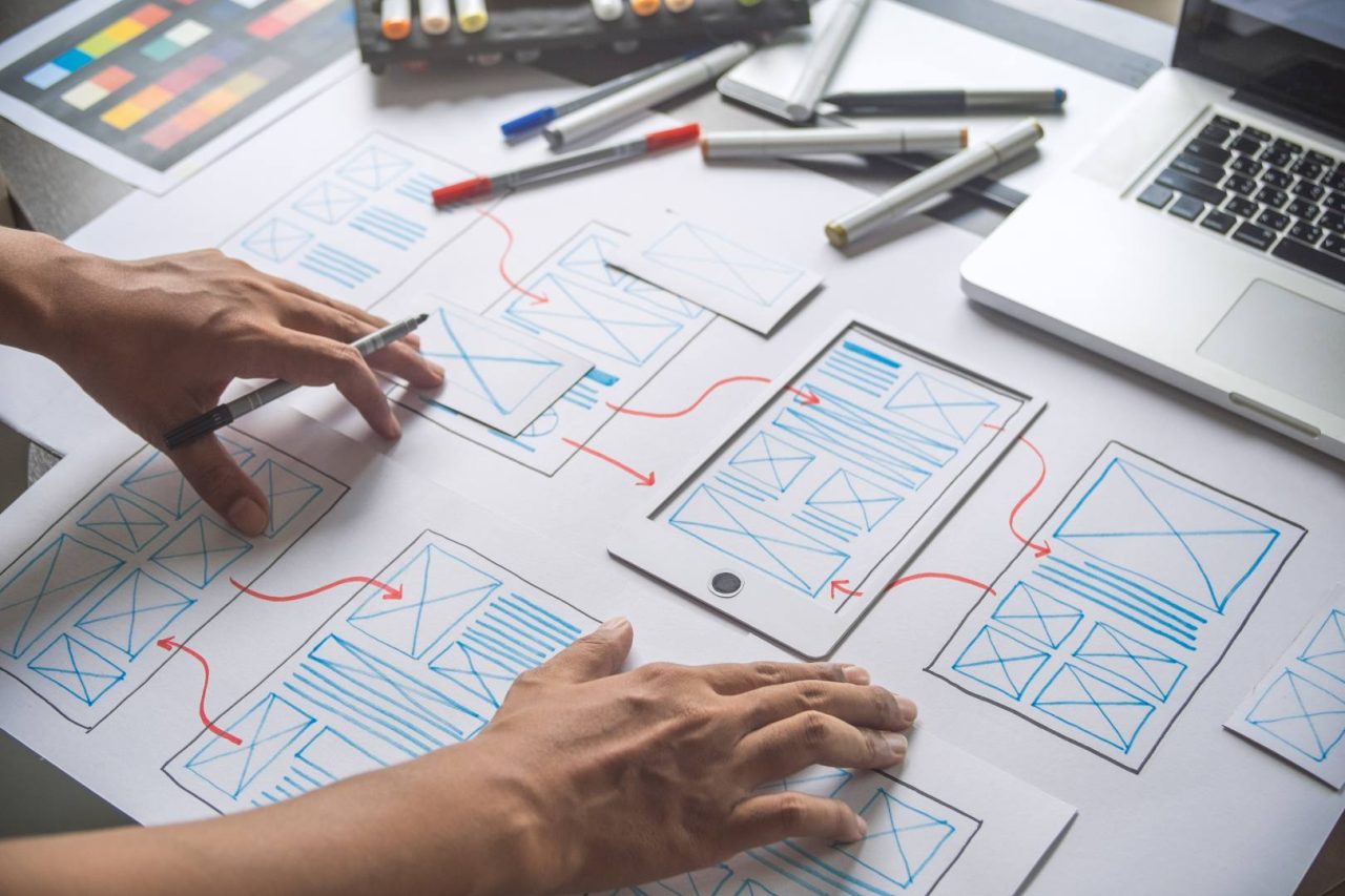
Here are some of our top website layout design ideas and tips to take your business to the next level:
#1 Ensure your website is responsive and mobile friendly
According to Statista, the usage of mobile devices to visit websites has grown significantly from 2015 to 2022. In fact, in 2015, mobile accounted for 31% of mobile traffic, as compared to 59% in 2022. This means that every winning website design has to account for mobile responsiveness.
Once you’ve established your website design and layout on a desktop, it will be time to consider how your website navigation will look and work on other mobile devices, including tablets and wide monitors. This is tricky, since what you see on the desktop may look completely distorted on a mobile device. This is very important to take a note of, especially if you’re a business. Imagine if your call-to-action buttons and text was stacked on top of other text and inaccessible to mobile users. This would cost you potential leads and business.
Our designer, Erin, further reiterates this point: “depending on the industry, mobile and tablet views can be a higher percentage of user views than desktop.” Effective design takes into consideration how all the imporant elements of design are applied and look on mobile.
Overall, if the user experience on mobile devices is of poor quality, you may lose visitor credibility, which would increase your bounce rate and signal to Google and other search engines that your website is not aligned with user needs. This could demote your website’s rankings and visibility to those searching for what you have to offer.
#2 Write copy that aligns with key customer needs and pain points
If you haven’t invested in a skilled copywriter, we recommend you do! A great website not only attracts visitors but converts them into leads and customers. A website copy should be written with the ideal customer avatar in mind. To do so, simply think of your ideal customer’s lifestyle and needs and write in the framework of why his/her life would be better if they interacted with your products or services.
Ensure that each page of your website has a goal by writing copy that urges the visitors to take the next step with you – either to sign up for a free tool you offer in an exchange for an email, to learn more about a topic by reading other articles, or to take the leap by working with you.
This is done by attuning to your customers’ pain points and lowering their defenses by showing how you are the perfect guide to help them transform their problems. The perfect enabler of trust are past reviews and case studies that showcase how similar problems were solved for others in the past. By understanding your ideal customers’’ behavior and psychology, you can reverse engineer your copy to align with what they are seeking.
Your home page should include a vision statement and an explanatory paragraph below it that showcases what you do, why you do it, and why you are better than your competitors! In addition, there should be a clear call to action button either below the explanatory paragraph or on the upper right hand corner of your website.
And lastly, all of this should fit into the above fold section of your homepage. As a rule of thumb, always place your most important content on top, so that it entices users to stay on your website longer and read more.
As the website copy guru, Don Miller, states in his insightful StoryBrand marketing book, “In every line of copy we write, we’re either serving the customer’s story or descending into confusion; we’re either making music or making noise.” Make your copy relevant and to the point – when you confuse the potential customers, you will most likely lose them. To make your website a positive user experience that converts, we agree with Miller that a website should:
- Portray the customer as the hero of your storytelling and yourself as the guide
- Don’t try to say it all; instead, focus on the key parts of your business that will help your customers survive and thrive
- Clarify your message so that you don’t confuse your audience; remember to speak to someone, not everyone

#3 Ensure that the design, colors, and images reflect your brand identity and core values
While copy is essential, so is how you portray your branding, or the images, colors, and layout design you use to represent your brand. For example, does your current logo represent your values and the demographic you seek to serve? Was it made in the 90s and as your company evolved, it currently misrepresents your brand? Then, it’s definitely time for an update!
Our first major tip is to ensure that your logo looks crisp and quality by having a high pixel solution. A retina display logo can go a long way in branding – ensuring that your logo looks great in print, in photography, and in a number of digital formats, including social media.
Another piece of advice is to have and implement a brand color scheme that showcases your brand colors vividly. The design of your website should have no more than a handful of colors (ideally three) that represent your brand in website boxes, banners, text, buttons, section dividers, and more.
When it comes to choosing images for your website, personal images are the best way to go. Images that show your business performance in real life are the most effective when it comes to building visitors’ trust and affinity towards your brand. They not only showcase transparency, but they also paint a picture of “how” your business performs and what your website visitors can expect by doing business with you.
Using your own images rather than stock digital designs is the first step to connecting to your visitors, while the second is looking for high-quality images. High quality images show that you are looking to be associated with the best of the best, and can be easily used and shared in brochures and other promotional material.
Finally, make sure that your images exude positivity and enjoyment. For example, if your brand has a friendly vibe, be careful not to choose images that are too serious and that paint your brand in an opposite light.
The audience strongly associates your photos with your brand, so be diligent that your images represent how your potential customers will feel after interacting with your products and services. It is a known fact in marketing that you should always include images that reflect positivity, generosity, and optimism.
#4 Keep it simple and orderly (make it easy for users to find what they’re looking for)
There is nothing more visually distracting and unappealing than encountering a mass block of text on a website that is wordy, distracting, and confusing. To use your website as a marketing tool, know that visitors’ attention spans are very short, and if you don’t showcase within 5-7 seconds what you do, why you do it, and how you can help your leads, the visitors are most likely to leave.
That is why it is of essence to remove all the unnecessary clutter, especially from your homepage. Generally, you should always keep your message short and sweet. Just enough for the visitors to learn more about you. Think of what you can say and how you want to convey your brand, so that it is attractive to your visitors.
Simply imagine if someone new just found you and how they may perceive you for the first time. You can even survey a group of people that can anonymously tell you what they think of your website (perhaps one batch of individuals that are leads and are on your email list or social media and another that has never interacted with your brand beforehand). You can learn quite a lot from this feedback!
#5 Typography and white space
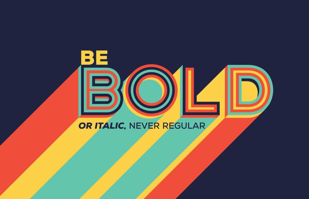
Typography involves more than just fonts! It actually dictates how your website is arranged and stylized through a consistent effort on all pages. Since people process visual elements faster than text and are reluctant to read most text fully, presenting a visually appealing website will not only create a memorable experience for the end user but will also showcase your brand personality, leading to brand recognition over time.
That is why having a consistent typography which includes a specific typeface (design stylizing of the type, such as size, boldness, and font style), colors, design elements, and space designation, is important. For example, even small details such as headers, links, the body of text, and other elements should look the same from one page to another.
Before you even go about designing your website, first figure out your typography and the strategy you will use to apply it on all of your website pages. Stick to your strategy in all your branding – from your website and social media, to your print materials.
White space, or the negative space on your website located between all the elements, is likewise a very important, albeit mostly ignored visual element of design. In essence, the fewer visual elements that compete for your visitors’ attention, the better! By ensuring that the visitors’ eye catches the right visual cues without overwhelm, they will be compelled to stay and engage on the website longer.
#6 Don’t forget the technical
Although most individuals don’t correlate the technical aspects of a website with design, for design to work and provide a seamless user experience, it has to be backed up with technical know-how such as website speed (which affects user experience as well as SEO optimization), technical and layout errors, as well as SEO content and technical optimization.
Without the technical improvements, your website may have trouble being found by organic visitors, and may even deter those that do find you from interacting with your website longer. For example, if your website takes longer than a few seconds to load, many visitors may choose to “bounce” from your website, not only lowering your SEO rankings but also deterring potential leads from becoming clients.
Since design is the foundation for user experience, having a website that works properly, loads quickly, and seems up to date, are all cues that you take your business seriously and are a flourishing brand that understands your customers’ needs.
Ensuring that your website is up-to-date technically also impacts your SEO rankings (or how far you show up on search engine rankings for your business terminology), especially if you have already invested in an SEO campaign. By integrating user-friendly design, layout structure, technicality, and targeted web copy, you can bring together a brand experience that is truly unique and memorable.
How Often Should You Update Your Website Design?
The frequency of updating your website is contingent on the informational architecture of one’s website – or how many pages a website has and their technical complexity – as well as factors like rebranding, SEO optimization, addition of new services or changes to existing services, and more.
So, how often should websites be updated? While updating your website often is a good sign that you are engaged and have the latest information and blogs ready for your visitors, updating your website for design, layout, and copy should ideally be done approximately every 3-5 years.
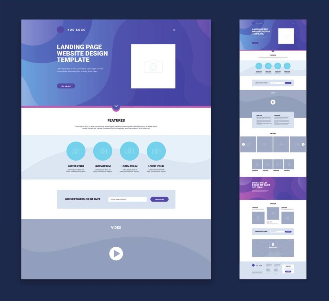
Since your brand is evolving with your new ideas and vision for your business, any changes you’ve made to your business and brand in the last few years should be reflected in your website design and content updates. And this includes your logo! If you’ve had it for over 10 years and it doesn’t represent your brand’s identity any longer, it is time to invest in a logo revamp.
The best way to start thinking about your website redesign is to ask yourself the questions in the “what to know before designing a website” section of this article, look at your favorite business websites, and research the best business website design ideas.
Final Thoughts
Our in-house designers have worked with hundreds of businesses and institutions to help them improve their website design and layout. As a result, what they found to be the most common denominator of great design is a seamless and engaging user experience. Other factors that make or break a website include having a brand-specific layout, topography, sales copy, and personalized images that reflect what the company does best for its customers.
And then, there is of course technicality! Without technical optimization, even the prettiest websites would deter visitors from sticking around. From broken links to layout errors and slow upload speeds, a well-designed website without technical optimization is like having avocado toast without the toast! Both are necessary for each others’ performance and the end result of an impeccable user experience.
We truly hope you found these in-house professional tips for website design and layout useful. And if you’d like to learn more about our approach to designing websites, check out the following resources:
Website Redesign Tips: When to Get a Website Redesign
How Long Does it Take to Build a Website
Overall, when you’re looking for the perfect web designer for your new website or a website redesign, we recommend that you check out their past work, years of successful experience and case studies to back them up, familiarity with your business niche, and how closely they’re willing to work with you to personalize the whole process.

