SolutionAttract Target Audiences By Improved CPG Branding Through A Custom Website
The custom food and beverage web design makes Bridgford products as available as possible. The average user journey is incredibly varied and often never the same way twice. Therefore, driving traffic to the redesigned website was not just enough. Bridgford needed to have all their bases covered and meet consumers at every stage of the buyer’s journey. This is why Bridgford offers the option to buy products directly from their site with the “Shop Now” page, locate where they can buy products near them, as well as more information for people not ready to take either step.
Bridgford’s website design allowed them to successfully offer multiple solutions to counter complex purchase paths. Site visitors can: purchase the product directly from their site, locate the nearest store to their custom location if they wish to purchase in person, or garner information regarding all things Bridgford. With four distinct dropdowns, traffic is easily corralled and gently guided in the direction most likely to result in a conversion.
Using Distinct CTA’s To Drive Action and Increase Conversions
Consumers visiting the “Shop Now” page have a much higher intent to make a purchase. They are currently at the decision stage of a buyer’s journey and are ready to act. This makes it critical to organize product information clearly to prevent a seamless buying experience. It avoids mental obstruction and frustration that could result in visitors leaving the site. Idea wanted to make sure Bridgford capitalized on traffic coming to this page by upgrading their product page designs with clear product imagery, and having both products and ordering available in the same place.
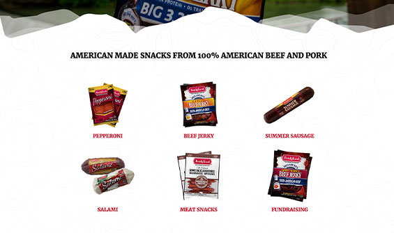
Organized navigation was also implemented in order to help users easily find what product they were looking for. Upon clicking the “Shop Now” page, products are categorized into 6 clear sections: pepperoni, beef jerky, summer sausage, salami, meat snacks, and fundraising. Within each main category are related products based on which form the user wants. You can click on each product to view specific details and information, as well as have related products listed below. If interested, visitors can simply add the item to their cart and continue their buying experience until ready to checkout.
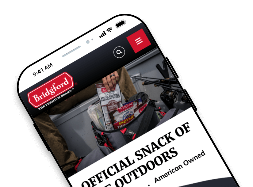
To reach today’s average consumer, you have to be aware of current purchasing trends. Besides the fact everyone has a phone now, with a target market of avid outdoorsmen, Bridgford’s average consumer is purchasing their products on the go. With information being more easily accessible from cellular devices and people spending an increased amount of time on them, it was imperative for Bridgford’s site to be 100% mobile-friendly and optimized. This means that their custom web design included back-end optimization for various size devices as well as a strategic mobile layout. By improving mobile design and speed, Bridgford can take advantage of mobile traffic users looking to make a purchase.
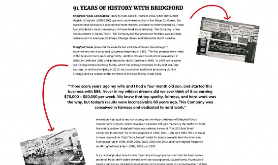
The modern website redesign presents a clear look, and a cohesive branding message focused on directly talking to their highest consumer demographic: males who like the outdoors. Product pages feature copy distinctly marketing their meat products as 100% American beef and Bridgford as a company that is fully American-based. By taking a more uniform stance on all pages helps to better resonate with their target customer demographic and show how much Bridgford has to offer.
While even the most rustic of men stick with tradition, more and more are intrigued by social media featuring their favorite outdoor hobbies and activities. To capture their target market’s attention, the Bridgford Outdoors page highlights their angler team to drive a deeper connection between consumer and company. This is linked to their Instagram and Facebook platforms that feature product and outdoor content, further solidifying their brand story. Linking to these platforms can help increase traffic to their posts and allows Bridgford to successfully reach a younger generation of targeted consumers, helping to establish brand loyalty earlier.
With an updated website featuring a custom redesign, access to online ordering and product information, mobile-optimization, and branding for their target market, Idea was excited to produce a site with many future benefits. Bridgford is now prepared for the future, and better than ever!

